
Clustered column charts allow you to compare values across one or more categories.
Series fields in clustered column charts are shown as unique values presented in the chart legend. Data fields are organized along the vertical axis and shown as columns. Category fields are organized along the horizontal axis and shown as groups of columns.
Example
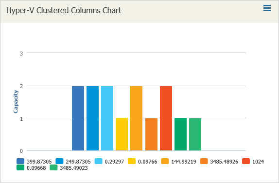
Create a chart that displays the number of different OSs installed on VMs; report data are shown for every Microsoft Hyper-V host.
The chart will visualize data from a simple report created on the basis of the Custom Infrastructure report template with the following report settings:
- Object type: Hyper-V Disk Partition
- Report columns: Name, Capacity.
To create a clustered column chart:
- In Veeam ONE Reporter, open the Dashboards section.
- Choose to edit the necessary dashboard and launch the Add widget wizard.
- In the Caption field, specify the widget name.
- At the Widget packs step, select the Report based widgets option.
- At the Widget info step, choose the saved Custom Infrastructure report.
- At the Widget type step, select Custom chart.
- At the Chart type step, select ClusteredColumn.
- At the Add widget step specify the following settings:
- Select Guest OS as the Series fields value.
- Select Host system as the Category fields value.
- Select Name as the Data fields value. From the Aggregate function list, select Count.
- Finish working with the wizard.
Send feedback | Updated on 5/4/2016
