 This is an archive version of the document. To get the most up-to-date information, see the current version.
Proxy Servers Overview
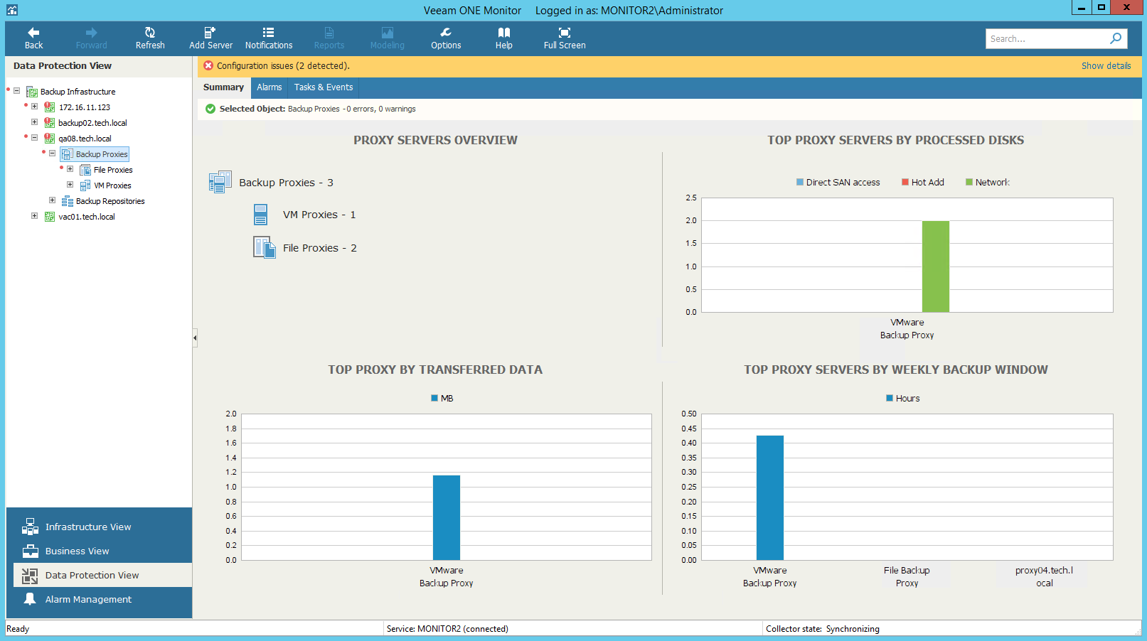
The summary dashboard for the Proxies node provides a configuration overview and performance analysis for VM proxies and file proxies managed by a backup server.
This dashboard can help you detect configuration inefficiencies in your data protection infrastructure. If the same proxy server appears to process a great number of disks, transfer the greatest amount of backup data and use the largest backup window, you might need to re-balance the processing load across your backup proxies. The charts may also help you reveal 'lazy' proxies that you might decide to decommission.
Proxy Servers Overview
The section shows the breakdown of backup proxies by the proxy type (VM Proxies, File Proxies).
Top Proxy Servers by Processed Disks
The chart shows 5 VM proxies that processed the greatest number of VMs over the past 7 days.
To draw the chart, Veeam ONE analyzes how many VM processing tasks were successfully performed by every proxy; failed tasks are not taken into account.
The chart helps you detect the most heavily loaded backup proxies and optimize the performance of your backup infrastructure. If specific proxies are overloaded with VM processing tasks, and the tasks often need to wait for proxy resources, you might need to deploy additional proxies or balance the processing load by assigning jobs to other proxies.
You can use the Chart views list to view the number of VMs processed by VMware and Hyper-V backup proxies.
Top Proxy by Transferred Data
The chart shows 5 backup proxies that transferred the greatest amount of backup data to the target destination (backup repository or replica datastore/volume) over the past 7 days.
For every backup proxy, the chart shows the total amount of data that the proxy transferred over the network after the source-side deduplication and compression. The chart can help you detect backup proxies that transfer the greatest amount of backup data and estimate the load that backup and replication jobs impose on the network.
Top Proxy Servers by Weekly Backup Window
The chart allows you to detect the most 'busy' proxy servers over the past 7 days.
For every proxy, the chart shows the cumulative amount of time that the proxy was retrieving, processing and transferring VM and file share data.
The chart can help you reveal possible resource bottlenecks. If the backup window on the chart is abnormally large, this can evidence of low source data retrieval speed, high proxy CPU load or insufficient network throughput.
In This Section