Report Output
The report will show uptime and downtime statistics for vSphere clusters for 2 time intervals (previous week and current week).
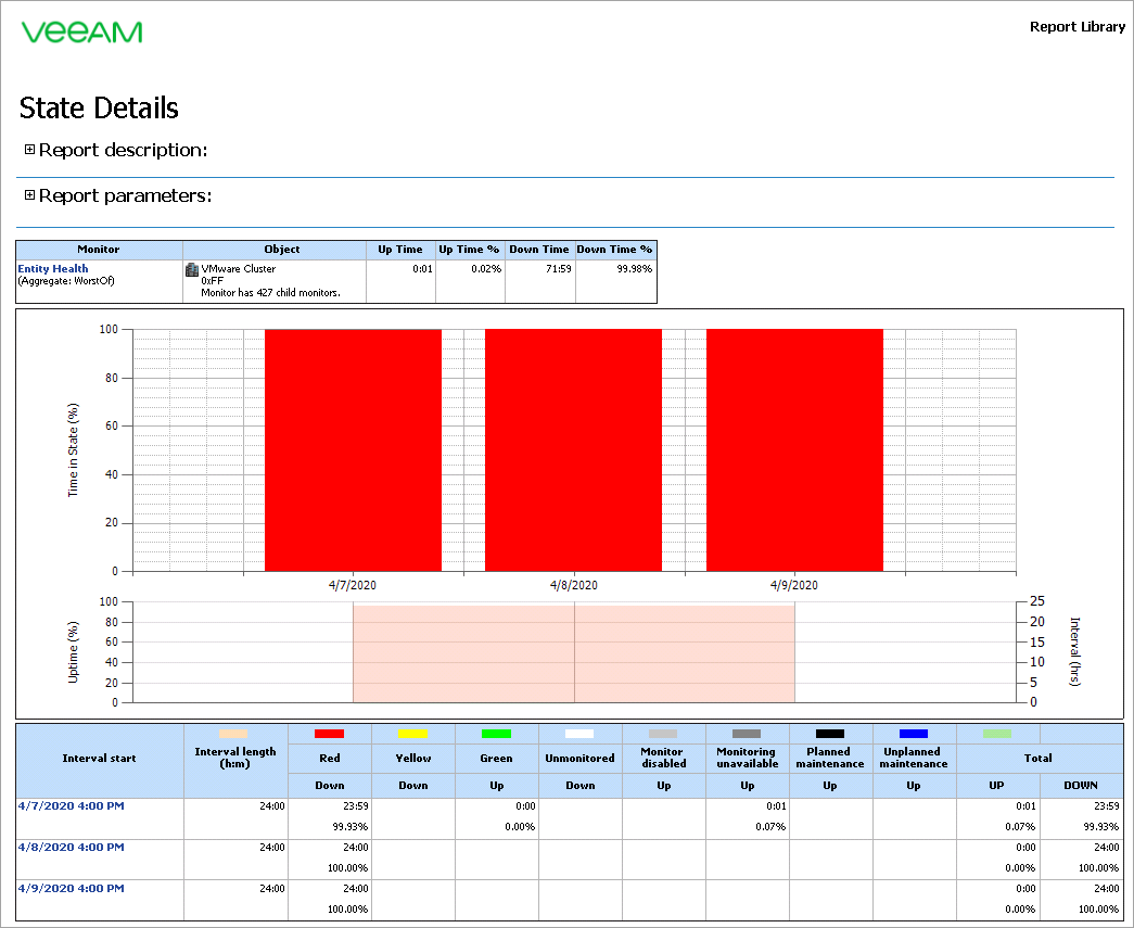
The green graph on the chart will represent healthy states, the red graph will represent unhealthy states. The SLO bar will be highlighted pink or gray, according to the following rule:
- If the percentage of time when the cluster was in a healthy state is above the SLO (%), the bar will be colored gray.
- If the percentage of time when the cluster was in a healthy state is below the SLO (%), the bar will be colored pink.
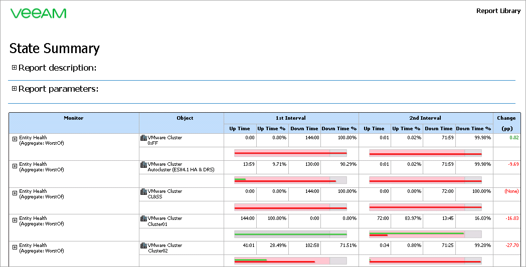
You can click the SLO bars to drill down to the Veeam State Details Report.