Report Output
The report output below shows Up/Down time in absolute values and percentage.
Note |
If you use daily aggregation, keep in mind that with default data grooming and aggregation settings, the current date may not have a datapoint in the data warehouse. In this case, the object will be marked Unmonitored for the current day, which means the object will have downtime. For more accurate reporting results, you can exclude the current day from the reporting period. |
The green graph on the chart will represent healthy states, the red graph will represent unhealthy states. The SLO bar will be highlighted pink or gray, according to the following rule:
- Gray: The percentage of time when the VM was in a healthy state is above the SLO (%). That is, the VM was in a healthy state more than 85% of time during the reporting period.
- Pink: The percentage of time when the VM was in a healthy state is below the SLO (%).That is, the VM was in an unhealthy state less than 85% of time during the reporting period.
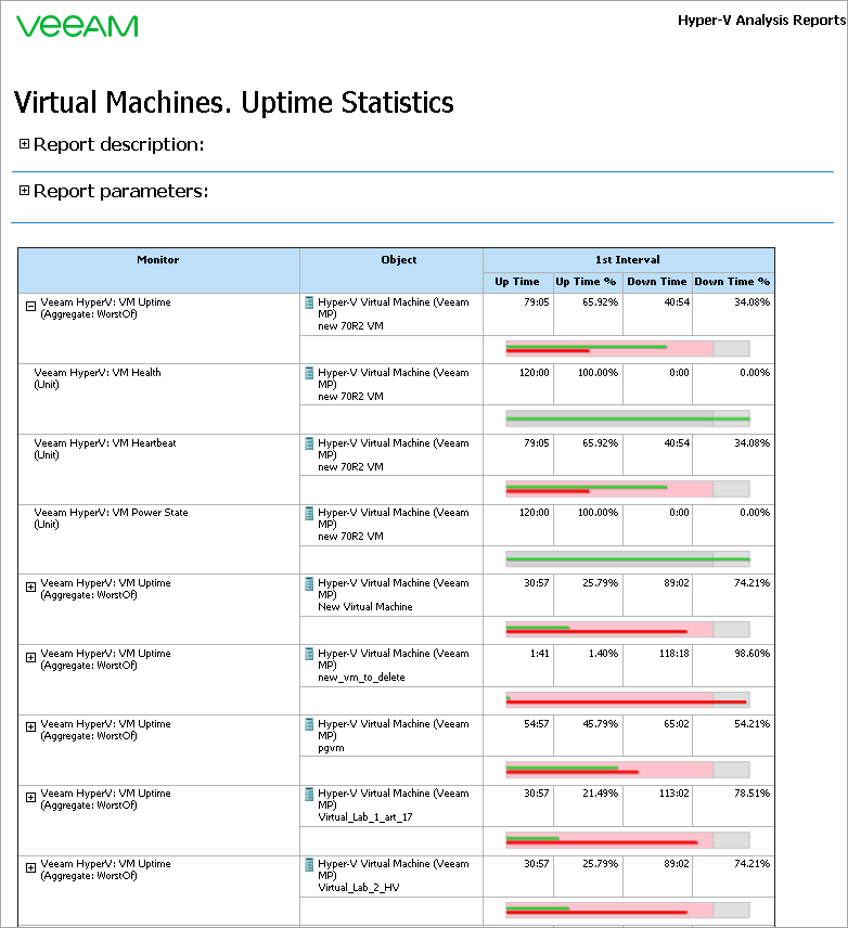
You can click a SLO bar to drill down to uptime details for the VM for the week.